Barbara Kruger
Kruger is a female conceptual artist of 1980's America, a time when the growth of mass media was in the air. Kruger juxtaposes text and image, most of which are found images with her own words to create a third meaning. Personal pronouns are used with a binary emphasis e.g "We won't play nature to your culture", as a way of grouping people together, such as men and women. The text anchors the image by interpreting that women are refusing to be subscribed to men.
At the time when Kruger was producing her work, men were in high position of power controlling the media. Women have been traditionally portrayed in men's culture as a source of temptation or evil - for example, Pandora and the forbidden box or Eve eating the apple in the garden of Eden, thus exposing vulnerability.
Her work concerns issues of power that challenge mass media and men's view of women. She changes the meaning of the text through the image. "Money can by you love" are words juxtaposed with a poster of a well groomed girl, pulling a face and sticking her tongue out. I first wondered who she is pulling the face at? Perhaps its a way of rebelling against the statement, she appears as if she comes from a high class family but at the same time craves love and attention. Or maybe she is mocking those of lower status to her. Overall I believe Kruger is trying to insinuate you can not be defined by wealth and power but who you are.
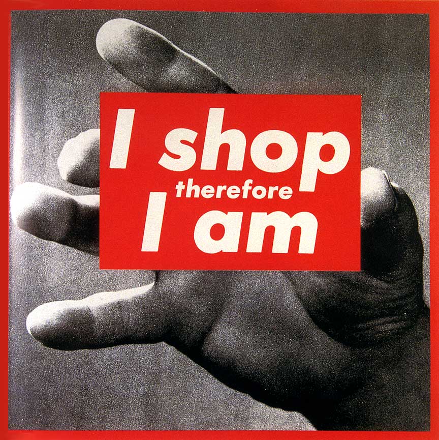
Again, "I Shop, therefore I am", is in a large red box positioned so it looks as if its being held in a hand and presented to you. At first glance, this image confused me somewhat, as the image seemed irrelevant from the statement. I carried out research to gain clarity meaning and discovered the quote historically comes from a french existentialist philosopher Rene Descartes, who coined the quote "cogito ero sum" meaning "I think therefore I am". It is questioning our existence based on our knowledge of who we are."I Shop, therefore I am" is commenting on our materialistic need that has been sold to us by mass media and consumerism. I also find it significant that Kruger has uses a hand to support the text. The ambiguity behind this reminds me of what people may refer to as God.If this is the case, its the case its undoubtedly suggesting that our sole purpose for existing is to shop.What we buy and what we own determines our character. Magazines and advertising tell us we can buy into lifestyles if we have the right product, that gives us an advantage over others. We are buying our way into existing instead of just experiencing it.
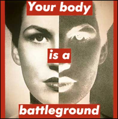
"Your Body Is A Battleground" is one of Kruger's most iconic pieces of art. It was used as part of a campaign in support of women's rights to birth control in 1989. The most noticeable aspect of this image is women's face being split into two halves - one half is a positive photograph the other a silk screened negative, making reference again to binary opposites and the duality of humans.
(How kruger expresses and presents these ideas, that seem sublime but are actually true - society denies the faults).
Jenny Holzer
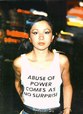
In similar ways to Barbara Kruger, Holzer comes from a generation of feminist artists emerging in the 1980's, She uses text to enlighten something that wants to be hidden through in silence. As an artist she seems motivated by words and uses a mixture of self writing and borrowed material. Her "Truisms" lasted from 1977-1979 which elevated her career to the public eye. She'd write these truisms herself such as "Abuse of power comes as no surprise" and "Protect me from what I want", anonymously fly-posting them around cities in USA. Sharing these ambiguous statements allows people to consider the meaning for themselves and the fact her work is put in public spaces means more people have direct access to it and rather than those who choose to enter art galleries.
Her work now focuses primarily on creating large scale projections which are cast onto prominent buildings worldwide. She also employs text from various different context, most significant examples include, quotes made by a polish noble laureate named Wislawa Szymborska and passages from declassified US army documents from the war in Iraq. I, myself find the text quite cryptic and difficult to understand. In all honesty I much rather prefer the aesthetic of Holzer's work and the way its being consumed by hundreds rather than the actual concepts she is trying to convey.


PostSecret is an ongoing community art project, in which people mail their secrets anonymously on a homemade postcard. It was founded by Frank Warren and all started when he decided to place thousands of self-addressed postcards around the state of Washington D.C, inviting random individuals to share their secret. This soon generated interest worldwide. Warren selects out of the thousands of postcards that turn up in his mailbox to then be uploaded onto the Postsecret website every Sunday.
The secrets need not all be very serious, for example the image below which was made out of a Starbucks cup reads, "I give decaf to customers who are rude to me".

Others are very serious, in particular postcards from young people suffering from self abuse. Covering the broad spectrum of peoples emotions, the postcards are a non-visual, easily accessible avenue for people to share something which they may otherwise keep to themselves.

The postcards often portray how people behave and interact with society, behaviour which may not be considered appropriate but which they still need share, albiet anonymously. It can be considered free therapy with no judgement given by Warren. The sender of the postcard may obtain a sense of relief through sharing a secret that they may be embarrassed about. I relate to this as Gillian Wearing's method, its easier to its confide in a stranger and even better if its anonymously than to confront the issues with a close friend or family member.
Shirin Neshat
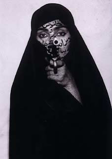
I find Shirin Neshat's work most thought provoking. Her theme of Islam and and the role of women is not a subject to which I myself have been exposed a great deal. Living in the west my influence mostly comes from thhe international media which in itself is quite biased. Seeing her images of Islamic women looking powerful, strong and not afraid and uncovered instills in me emotion and understanding and encourages me to challenge my own ideas aabout islam and to learn more about the pligth of women, in that part of the world, where freedom is suppressed. Neshat herself, has experienced an upbringing with both eastern and western influences, having been born into a wealthy family which welcomed westernized values and ideologies into their home. After being educated in a catholic school in Tehran, she was encouraged by her father to migrate to the USA to study art in Los Angeles, coincideing with the beginning of the Iranian revolution of 1979 and soon after that the war between Iran and Iraq followed. This resulted in Neshat losing all contact from her family and she wasn't able to return to her native Iran until 1990. Seeing the traumatic ordeal that her loved ones had suffered, led to her first production of work - a series of photographs entitled Women of Allah.
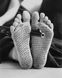
These specific two shots are relevant to my work in that i too have chosen to apply texts onto the body, primarily the hand and feet. In Neshat, case my interpretation to why her work is so powerful is that the text becomes the muted voice that women in Islam have to suffer and that their religion imposes on them. Choosing to put the text on the specific parts of the body that are traditionally covered with clothing, enhances the symbolism even furthur. The consistent presence of a gun in each image, I don't think, is there to threaten the viewer but is a symbol of the power that these women know they have wihtin them and that they want us all to appreciate. Neshat, could of used any other objects, as opposed to a gun, however this would of had less impact in conveying the urgent message that she is trying to get across, of self belief and confidence. Although the images engage a western audience, Neshat makes no attempt to translate the Farsi callligraphy, which I imagine has been incorporated deliberately to highlight our misunderstanding as an outsider. We initially make associations of the Islamic culture, tying it closely to war, conflict, terrorism and dictatorship etc. The image of an Islamic women holding a gun, although follows the same theme of war and conflict, is not a static one. The introdcution of the text, encourages the viewer to move on from the theme of war and conflict to thinking of the larger issues that Islamic women face.
Gillian Wearing
In Gillian Wearing's series called "Signs", the subjects hold up a piece of white card, on which they are asked to write how they are feeling at that particular moment in time. Wearing entertains a fascination in getting to know peolpes inner thoughts, secrets almost, with strangers that are approached on the street that to you and me look like regular everyday people, but when asked to write a comment on a blank parchment often reveal themselves to be in turmoil or in an emotional state that is not visible their exterior image. The example below portrays a man in a business suit holding sign tha treads "i'm desperate" - a man like many hundreds walking the morning shift in london that on first glance look very in control and professional. I find enlightening to imagine that many of these people are the complete opposite and that they have neuroses and 'human' emotions as anyone else yet they choose to cover it up in a suit. This reflects my own work which attempts to show how people hide their true selves with fake confidence and make belief lifestyles.


The engagment and sharing that both the subject and the audience enjoy through these images, helps both parties to realise that their are other individuals in soiciety with similar issues and that we are not alone. A fundemental idea that her work underlines is that people more readily share their most inner thoguhts and feelings with those who are not so closely attached to their everyday lives. We often don't want to admit to our loved ones, how we are really feeling or who we really are, because of some inner pride. Wearing's images makee us sympathise with subject and forces us to reconsider we view stereotypes in society.
Jim Goldberg
Goldberg documents subcultures from different social backgrounds from all walks of life. His subjects are given the freedom to write their own meaningful messages onto the photograph., which provides an opportunity to individualise his work to his subject's background and story. This also creates a personal link between the viewer and the photograph. The viewer does not merely look at an image, giving their own defition, the messages give further insight to the emotion that is being portrayed.
Goldberg is renowned for exploring the extremes in life, for example in his series named Rich and Poor,he examines the lifestyle of both the wealthy and less fortnuate. There two examples below, demonstrate the added meaning that the short messages contained within can provide. Without the messages the viewer would think that the suggested "Wealthy Couple" would be more fortunate and happy with their lot, in contrast two theem, the squalid surrounding where the other family are living, would lead the viewer to think that they are less fortunate and therefore less happy with their lives, not having the same standard of living or luxury afforded. However the role the text plays in each image is to detroy the precopection that the image alone would give, that is of course, the less well offf family are much happier and developed a loving environment, whereas the older couple have all the materialistic things around them but are missing the loving bond with each other (in regards to the husbands comment on their marriage stating that he is merely "satisfied" with what he has got but does not show any affection or appreciation.

Duane Michals
Duane Michals uses text to build a storyboard narrative which gives meaning to the image, although neither are literally related. The text is personal to his own experience of growing up as a homesexual under the disapproving eye of his parents, most notably his father's. He uses his photography to address his own story but also that of many young gay men in society.
His photographs are often sequential leading the audience through a story, and his handwritten text provides the emotive narration. A classic example of this image text combination can be found in Michals photograph entitled "A letter from my father". Within the frame we are presented a scene of a young man looking troubled, possibly gazing through a window, whilst his supposed "parents" look sternly on. It appears the boy has said or done something to anger or disappoint them but we don't know what. Although we don't know what as happened exactly, if we research into Michals own life, we can assume it may have something to do with his experience of confessing to his parents about his sexuality, and he may have used this image to re-stage thatt key moment in his life. His handwritten text enables him, to make the image personal to him, rather than leave it as a generic image to which the audience can add their own interpretation.

I like to feel that I've taken on the aesthetic of Michals approach to address my own personal issues within my family and particulary a very close member of my family. I use my friend's image too represent the member of my family who is the subject of my work. In this way I maintain the anonymity of my relative, yet through my text i'm relating the image to a real situation, that is ongoing and which has had some effect on me and my other relatives.
Duane Michals uses text to build a storyboard narrative which gives meaning to the image, although neither are literally related. The text is personal to his own experience of growing up as a homesexual under the disapproving eye of his parents, most notably his father's. He uses his photography to address his own story but also that of many young gay men in society.
His photographs are often sequential leading the audience through a story, and his handwritten text provides the emotive narration. A classic example of this image text combination can be found in Michals photograph entitled "A letter from my father". Within the frame we are presented a scene of a young man looking troubled, possibly gazing through a window, whilst his supposed "parents" look sternly on. It appears the boy has said or done something to anger or disappoint them but we don't know what. Although we don't know what as happened exactly, if we research into Michals own life, we can assume it may have something to do with his experience of confessing to his parents about his sexuality, and he may have used this image to re-stage thatt key moment in his life. His handwritten text enables him, to make the image personal to him, rather than leave it as a generic image to which the audience can add their own interpretation.

I like to feel that I've taken on the aesthetic of Michals approach to address my own personal issues within my family and particulary a very close member of my family. I use my friend's image too represent the member of my family who is the subject of my work. In this way I maintain the anonymity of my relative, yet through my text i'm relating the image to a real situation, that is ongoing and which has had some effect on me and my other relatives.




No comments:
Post a Comment